SoilFLO
A B2B platform for monitoring land and waste on construction sites.
00

problem
At the time, SoilFLO faced two problems: a rebranding that had been commissioned six months earlier but not yet implemented in the platform, and a dashboard that was in critical need of a redesign. The existing dashboard displayed widgets for all features in a chaotic order, mostly without any customization, and only allowed users to rearrange them on the dashboard.
solution
Conduct a platform audit, study the users, create a unified design system, and carry out a full, step-by-step redesign of the platform, starting with the dashboard, which is the most important element of SoilFLO.
SoilFLO is a fast-growing startup addressing a major pain point for many construction sites: tracking land and waste. We did a lot of work and launched plenty of useful features, but the platform’s style and interface were a constant concern - they were unattractive and outdated.
Our users had been complaining about the dashboard for a long time. It was built before I joined and was basically a jumble of widgets for the main features, scattered chaotically across the page. Even though users could move, delete, or add widgets, the dashboard was extremely inconvenient, and most users didn’t linger on it - they went straight to the sections they needed.
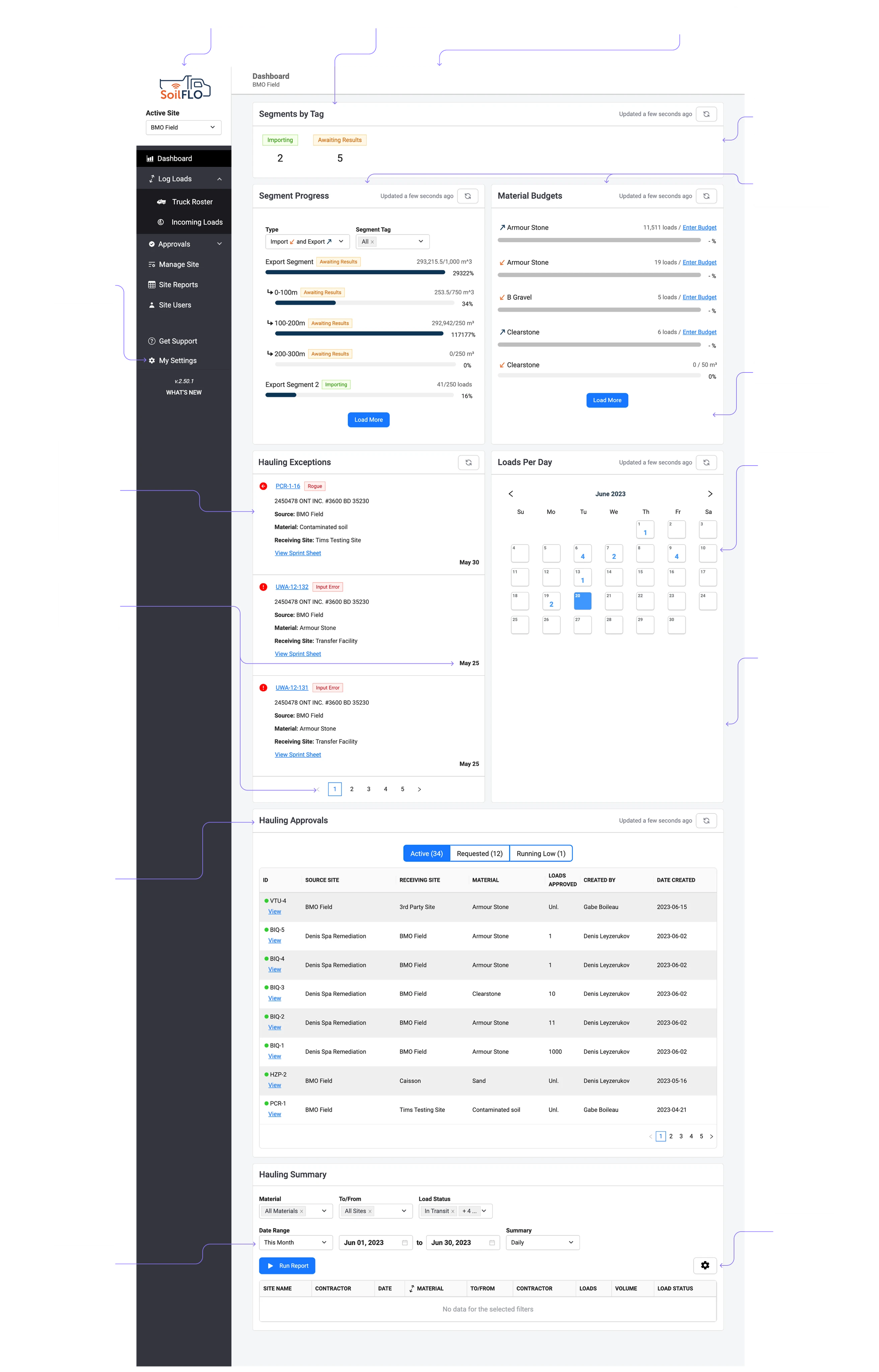
After auditing the dashboard, I conducted user research to build hypotheses about their requirements and needs. Using the results from surveys and interviews, I generated a large set of potentially useful metrics for the dashboard. Our team considered metrics that were either already tracked within the platform or could be easily implemented, since we already had all the necessary data to calculate them.
The next step was creating wireframes. We explored several options. The final version best meets the needs and requirements of our users and aligns with their journey within the platform. The hierarchy of widgets, as well as the information hierarchy within each widget, reflects user preferences and priorities.
The dashboard’s focal widget became the site progress tracker. It is divided by segments and materials, with both current and target values displayed for each. Next to it, I placed the widgets most requested by our users. Important analytics and additional widgets follow. Users can easily navigate to any section of the site directly from each widget with a single click, significantly shortening their user journey compared to the previous dashboard, where this was not possible.
00 results
+140%
page viewing
+240%
average clicks
+60%
analytics adaptation
+600%
average time on page
01

02

03

04


